
Media Queries in eCommerce Store Design
Why You Need Media Queries to Build a Successful Online Store
Media queries are an essential component of responsive web design, allowing websites to adjust their layout and presentation based on the screen size of the device used to access the site. A media query is a CSS technique that applies different styles to a web page based on the user's device or screen size. In this article, we'll explore the technical aspects of media queries in web design.
Syntax of Media Queries
Media queries are written using the @media rule, which is followed by a media type and a set of conditions that apply to the website's styling. An example of the syntax for media queries is as follows:
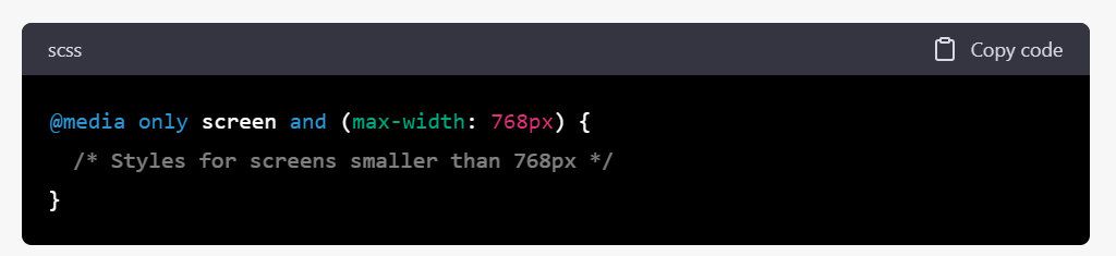
In the example above, the media query applies only to screens smaller than 768 pixels wide, and any styles specified within the curly braces will apply to the website's styling for that screen size.
Media Types in Media Queries
Media types are used in media queries to define the type of device or medium used to access the website.
There are several media types available, including:
- all: This media type applies to all devices and mediums.
- screen: This media type applies to devices with a screen, including desktops, laptops, tablets, and smartphones.
- print: This media type applies to printers and print preview modes.
- speech: This media type applies to screen readers and other assistive technologies.
Media Features in Media Queries
Media features define the characteristics of the device or medium used to access the website. There are several media features available, including:
- width: This feature specifies the width of the viewport in pixels.
- height: This feature specifies the height of the viewport in pixels.
- orientation: This feature specifies the orientation of the device, either portrait or landscape.
- aspect-ratio: This feature specifies the aspect ratio of the viewport.
- resolution: This feature specifies the resolution of the device in dots per inch.
Combining Media Types and Media Features in Media Queries
Media types and media features can be combined to create complex media queries that apply different styles based on the device's characteristics. For example:
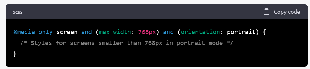
In the example above, the media query applies only to screens smaller than 768 pixels wide in portrait mode, and any styles specified within the curly braces will apply to the website's styling for that screen size and orientation.
Benefits of Media Queries
Media queries provide several benefits to web designers, including:
- Improved User Experience: Media queries ensure that a website's layout and presentation are optimized for the device used to access the site, resulting in a better user experience.
- Increased Accessibility: Media queries enable web designers to create websites that are accessible to all users, regardless of the device they use to access the site.
- Reduced Maintenance: By using media queries, web designers can create a single website that adapts to different screen sizes and devices, reducing the need for separate mobile and desktop versions of the site.
Media queries are a powerful tool for web designers, enabling them to create responsive online shops that make for a user experience that translates into sales without frustrations caused by the user interface.

About the author
eComm Pro
The Syncrony Digital Team who combine expertise to write technical articles that we hope will assist both our customers and other ecommerce professionals looking to improve the online stores they build and the ROI of their customers.